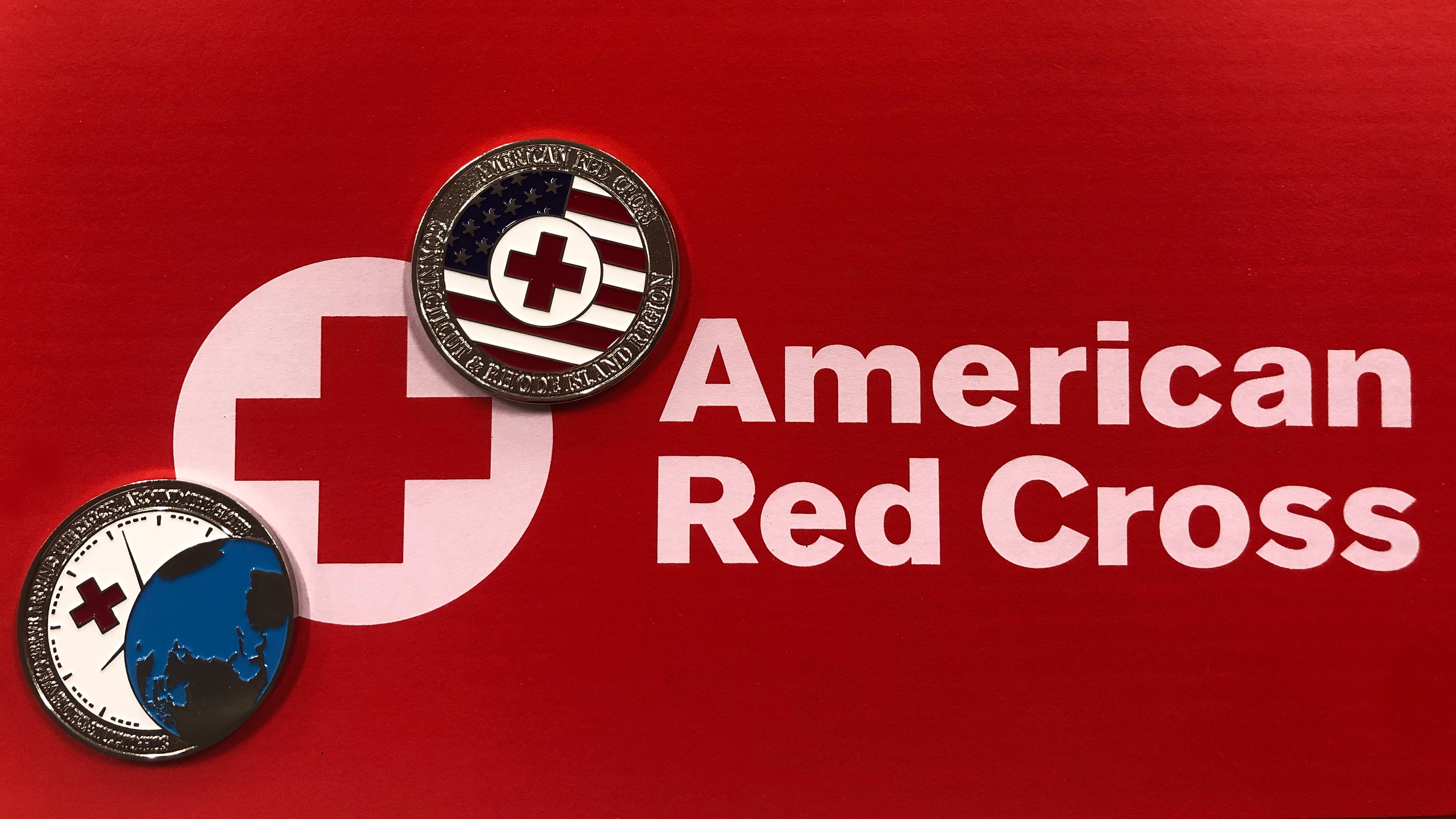
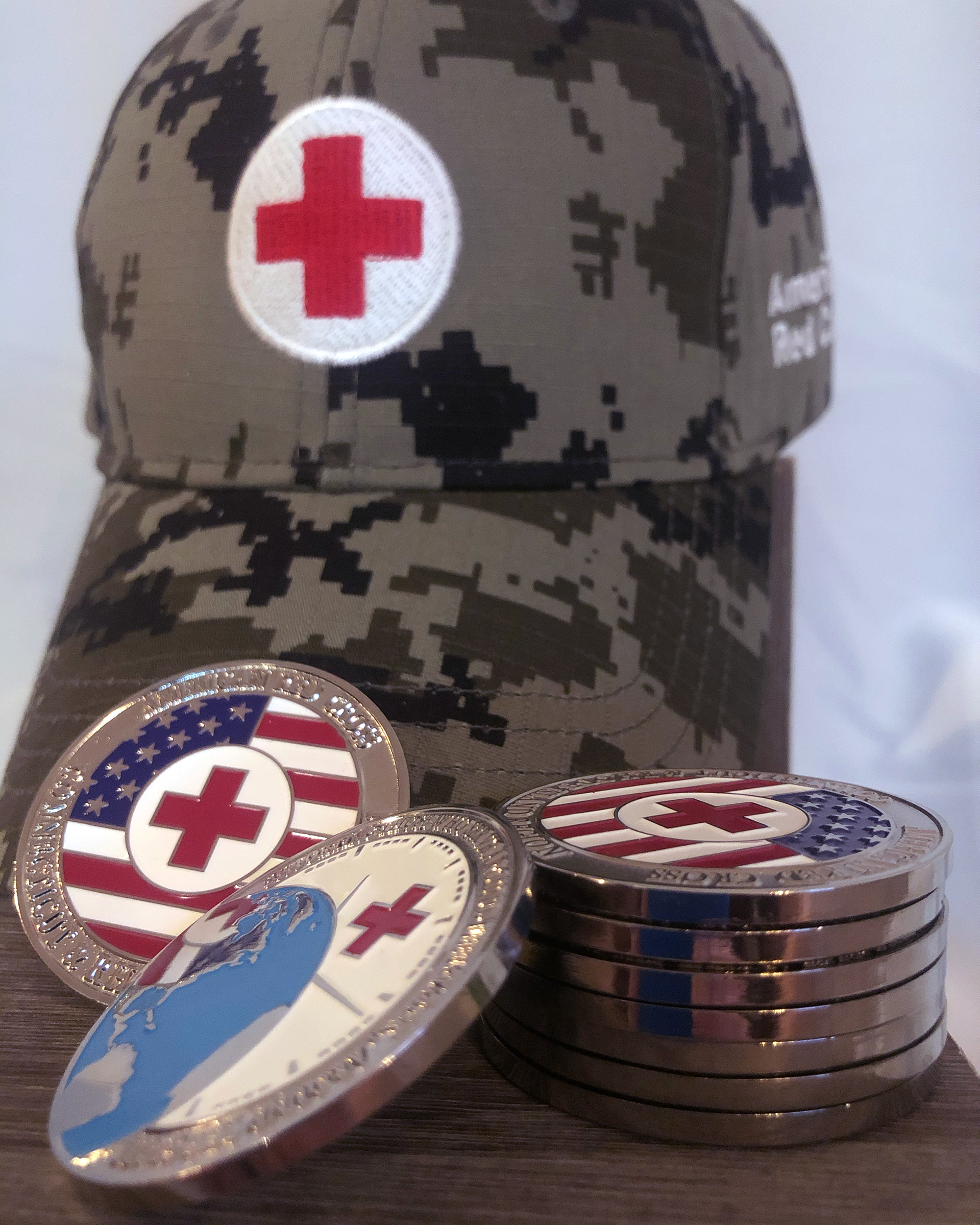
Background // Challenge coins are symbols of honor and achievement passed amongst those in the military and military organizations, such as The American Red Cross. They're a token of pride and success, as well as collector's items in the military and historian community.
The American Red Cross - New England Region requested 2 separate coins:
Coin One: The Service to the Armed Forces faction, which provides care and services to both active duty military & military families, as well as veterans.
Coin Two: Coming Soon New England Red Cross - Connecticut & Rhode Island Region
American Red Cross, Service to the Armed Forces
Preliminary Designs
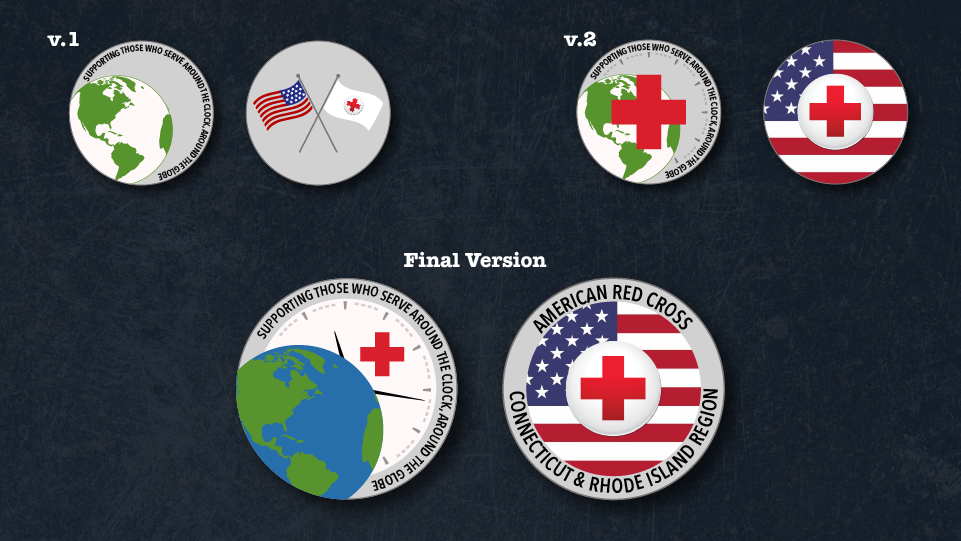
V.1 Heads //
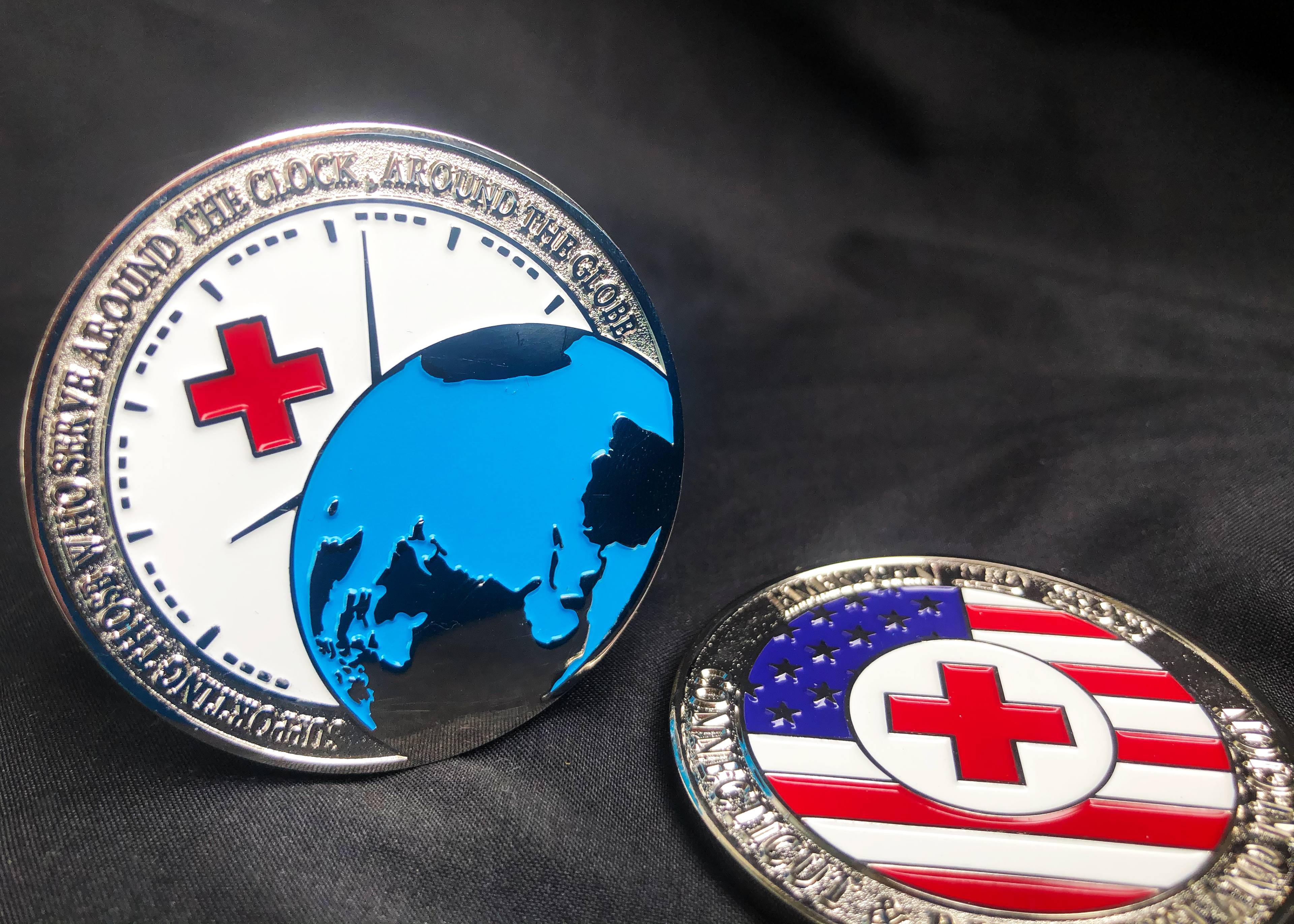
The Service to the Armed Forces faction of the American Red Cross has a slogan: "Supporting those who serve around the clock, around the globe." It was imperative that this mission statement was featured on the coin. It was also requested that a globe was present.
V.1 Tails //
The back of the challenge coin was intended to incorporate both the American Flag as well as the American Red Cross logo. In the initial design, the American Flag was crossed with the American Red Cross flag, but it was decided that the Red Cross logo should be more prominent.
V.2 Heads //
After presenting the first design, I was requested to put the Red Cross emblem over the globe. This breaks their brand guidelines, which requires the logo overlaid on a white background. Heads V.2 was a classic case of "you have to see it won't work to believe it won't work." In the meantime, I'd begun building what would become a clock face in the final version of the logo.
V.2 Tails //
In deciding that the Red Cross Logo should be more prominent, it made perfect sense to drop the American flag design into the background while pulling the Red Cross logo to the foreground. This created a clean, simple design that compliments the more complicated elements on the flip side.
American Red Cross, Service to the Armed Forces
Final Design

Final Heads //
When it was apparent that it wasn't worth breaking brand guidelines to include the Red Cross logo on top of the globe, I presented my clock face design, which became the final version.
By adding a white background, I was able to incorporate the smaller Red Cross, and by adding simple hands to the face, I was able to bring clarity to the abstract clock design. This design also allows you to turn the coin 360° without losing functionality of any design elements.
Final Tails //
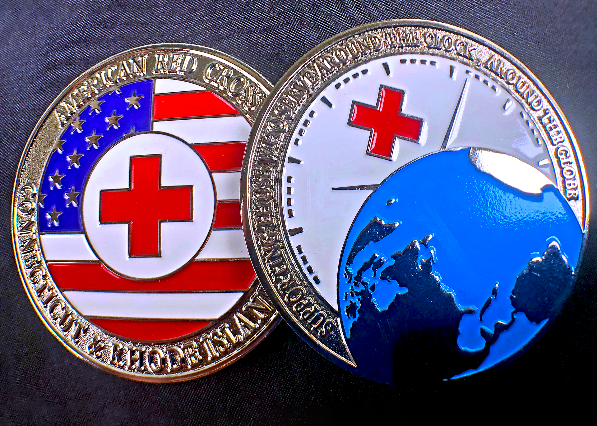
The final addition was a simple section on the outside margins of the coin showing where it originated, with the simple statement "American Red Cross - Connecticut & Rhode Island Region". These coins are provided only to individuals who have done amazing work in the name of humanitarianism, and we felt it was important to include the point of origin where the coin was received.
American Red Cross - Connecticut & Rhode Island Region
coming soon